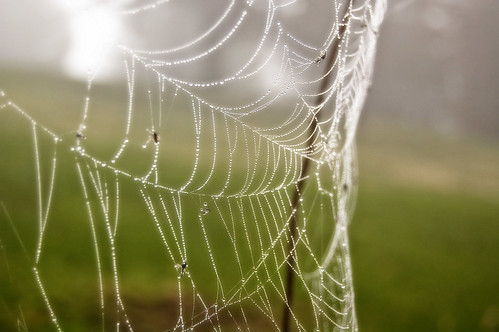
When I got home, I downloaded it, processed it, then applied some artsy-fartsy effects to pretty up this scene of insect demise (what's that? You didn't notice the dead bugs?).
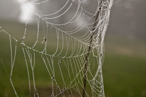
Anyway, for those of you who don't dig the foggy effects, here's the other photo:
I don't really know which one is technically better... I do know that I wish I could have gotten just a smidge closer, but it was pretty wet and muddy, and I was crawling around in what is a notorious poison-ivy patch (I spent a lot of time there in my childhood, by the way).
I'm curious (in more ways than one, actually), but which picture do you like better?
Enjoy!
-DP
--
Posted By Dan to The Wisdom of a Distracted Mind at 4/21/2008 11:37:00 AM


The second. Know nothing about technical matters, but find the second more appealing.
ReplyDelete# 2 for me, I know not why, Bill
ReplyDeleteI'm voting against the majority and saying the top one. I love the saturation of color in that one. (Hugs) Indigo
ReplyDeleteThe top one.
ReplyDeleteThe lighter green, and the light itself seems brighter and as if to sparkle more.
It seemed duller, comapratively, to scroll down and see the other image.
Now to see what others thought............
... I guess it is up to me ... I like the second, untouched picture ... you got it right the first time ...
ReplyDeleteHi !!!!! I have to say that I prefer the top one because the fog added a little bit of mystery to the shot so I say that I pick the first one. Thanks for sharing this.
ReplyDeleteI think the untouched one is better because the background is more subdued and the subject stands out much better.
ReplyDeleteB.
the top one
ReplyDeleteWhat a great picture! I like the top one best....the green really enhances the
ReplyDeleteweb.